
Design a Food Delivery App in Figma with Vibe Design
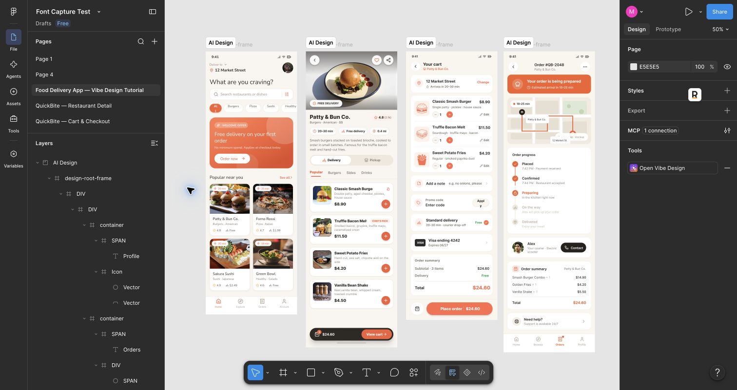
I used the Vibe Design Figma plugin to turn a short food delivery app brief into four screens: a home page, a restaurant page, checkout, and order tracking. The finished QuickBite flow sits together on one Figma page.
The useful workflow is to keep one Vibe Design project for the app. Start a new conversation inside that project for each screen, then use Re-render on a result when you want to draw it on the Figma canvas. You can iterate on an existing screen without starting the whole project again.
1. Open the plugin and set up the canvas
Open a Figma design file, launch Vibe Design, and sign in if prompted. In the AI Design tab, create a project for the app. Choose App / Mini Program (375) so the output starts at a mobile width of 375 px. I named the example app QuickBite and used a warm orange accent, rounded cards, and food photography as a shared visual direction.
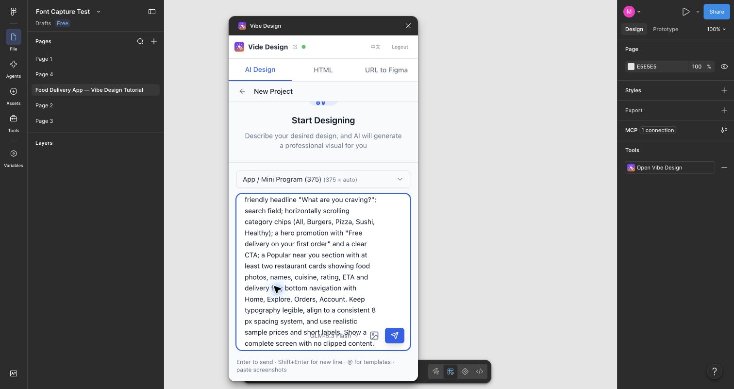
Give the first conversation enough detail to establish the style. Here is a copyable home screen brief:
Design a polished 375 px mobile home screen for QuickBite, a food delivery app. Use a warm orange accent, an off-white background, rounded cards, clear type, and appetizing food photos. Include a delivery address, search field, food categories, a promotion, nearby restaurants with ratings and delivery times, and a bottom navigation bar. Make it feel like a real app screen, with readable labels and realistic content.
Send the prompt and wait for the plugin to generate the design. The result appears in the plugin and can be rendered into Figma.
2. Check the first render, then refine it
The first home screen had the right structure, but some restaurant image areas appeared as gray placeholders. That is a useful reminder to inspect the Figma canvas, not just the plugin preview.
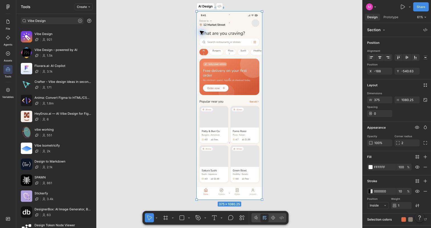
I sent a follow-up asking for visible food imagery and rendered the updated result. After the plugin was improved and the design was rendered again, the home screen showed food photos in the restaurant cards. If a result has been updated, use its Re-render button to draw the latest version on the canvas.
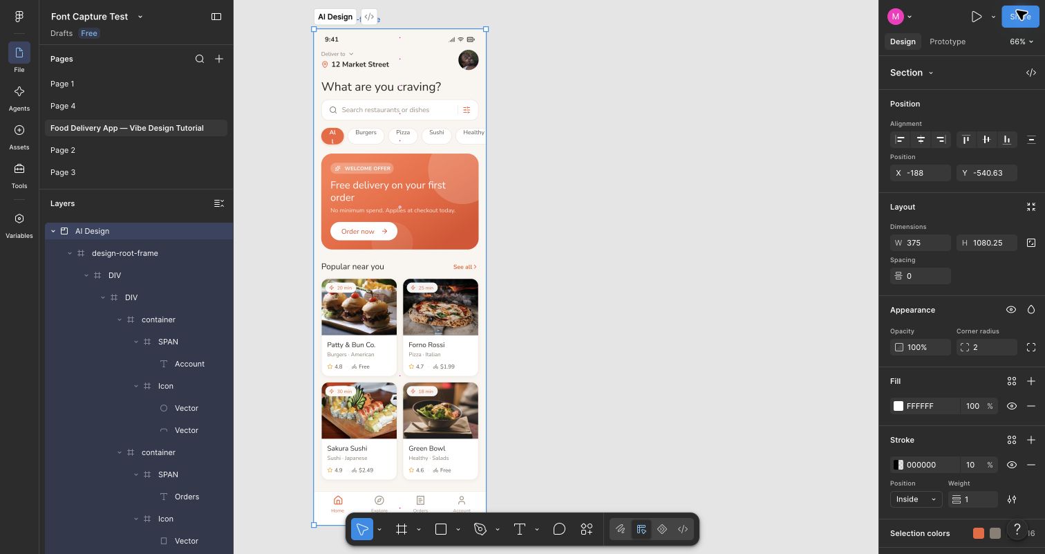
This is a good point to check the basics: do images appear, are labels readable at mobile size, and does the bottom navigation fit inside the frame? A convincing preview is only the first pass; the rendered Figma layers are what you will hand off or edit.
3. Create the restaurant screen in the same project
Start another conversation inside the QuickBite project. Describe the next screen as part of the same app, so the plugin has an explicit style and content reference:
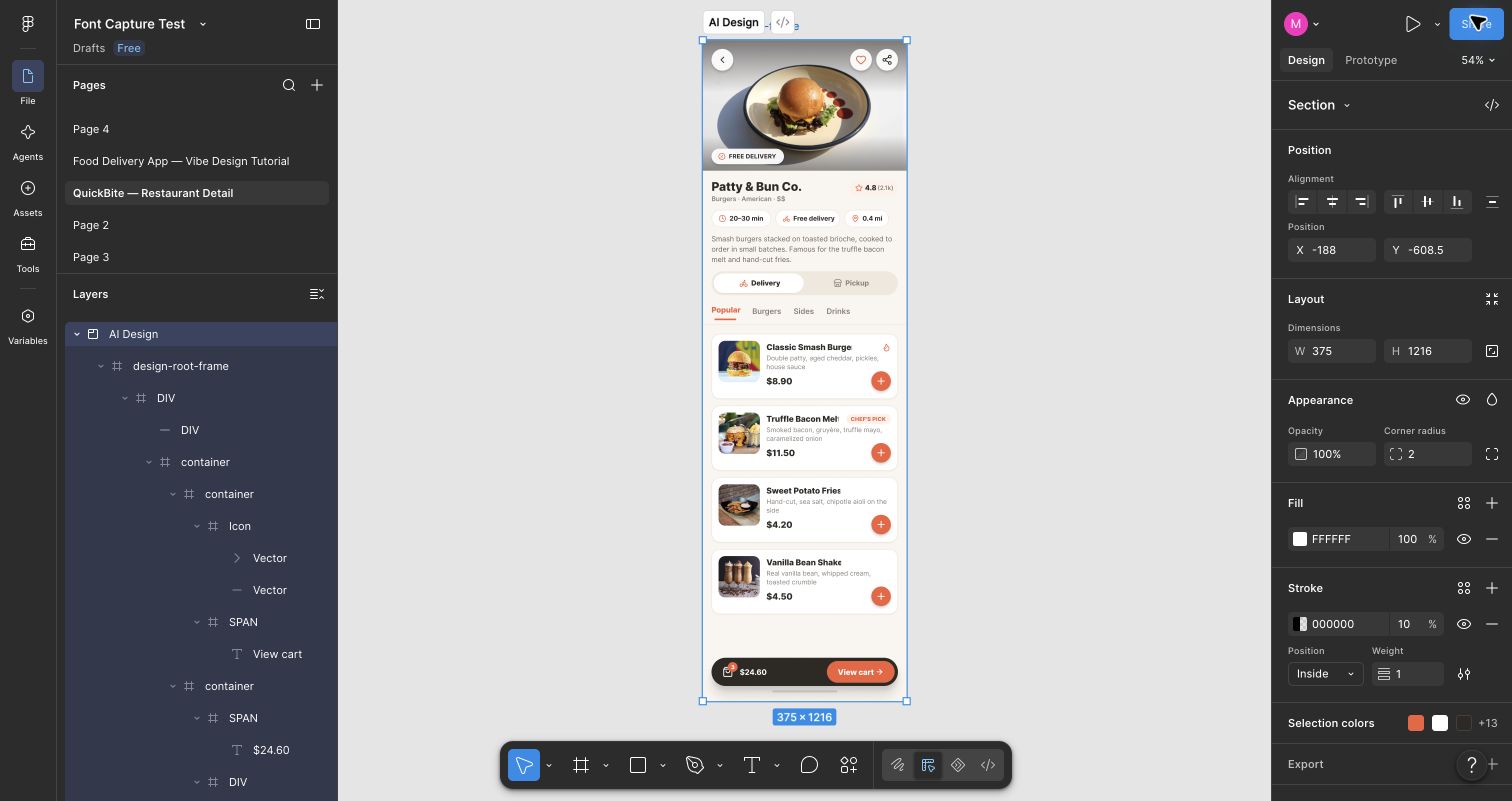
Create the restaurant detail screen for QuickBite at 375 px wide. Keep the warm orange accent, rounded cards, typography, and bottom navigation from the home screen. Feature Patty & Bun Co. with a large burger photo, a 4.8 rating, 20–30 minute delivery, and free delivery. Add Delivery and Pickup options. Show menu cards for Classic Smash Burger ($8.90), Truffle Bacon Melt ($11.50), Sweet Potato Fries ($4.20), and Vanilla Bean Shake ($4.50). Include a prominent View cart action.
Review the generated result, click Re-render when needed, and place the rendered screen beside the home screen in Figma.
4. Add checkout and order tracking
Create two more conversations in the same project, one for each remaining screen. Carry forward the app name, visual direction, restaurant, and item prices in each prompt. Specific content helps, but it does not replace a final consistency check.
For checkout:
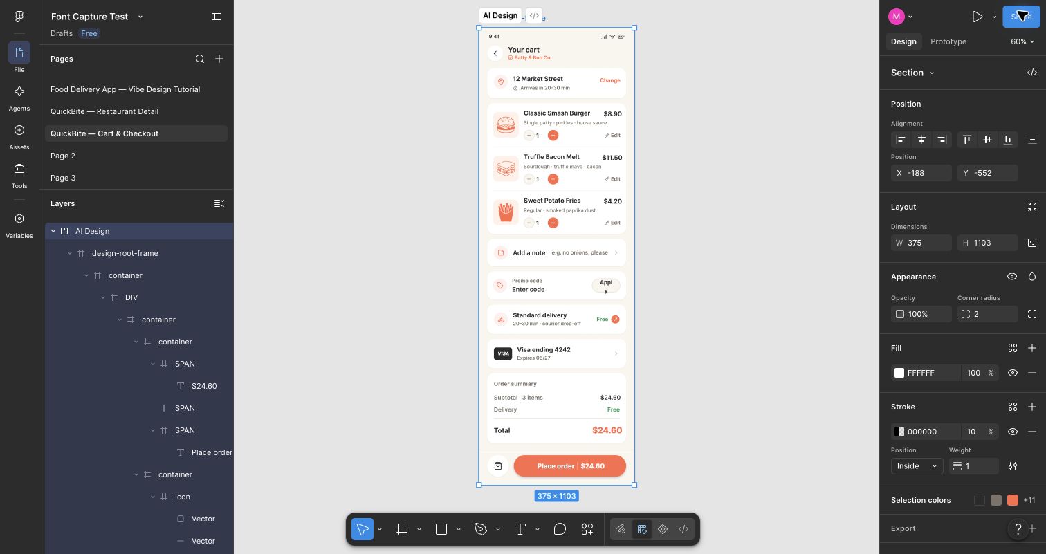
Create a QuickBite cart and checkout screen at 375 px wide, matching the previous screens. Show one Classic Smash Burger ($8.90), one Truffle Bacon Melt ($11.50), and one Sweet Potato Fries ($4.20). The subtotal and total are $24.60, with free delivery. Include delivery to 12 Market Street, a Visa card ending in 4242, a promo code field, and a clear Place order button.
For tracking:
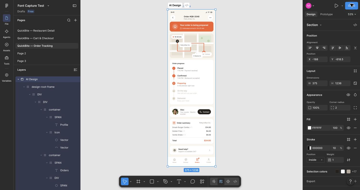
Create an order tracking screen for QuickBite at 375 px wide, matching the previous screens. Show order #QB-2048, the status “Your order is being prepared,” and an 18–25 minute estimate. Include a simple map with restaurant and delivery markers, a five-step progress timeline from Placed to Delivered, courier Alex, a Help action, and an order summary. Keep the $24.60 total consistent with checkout.
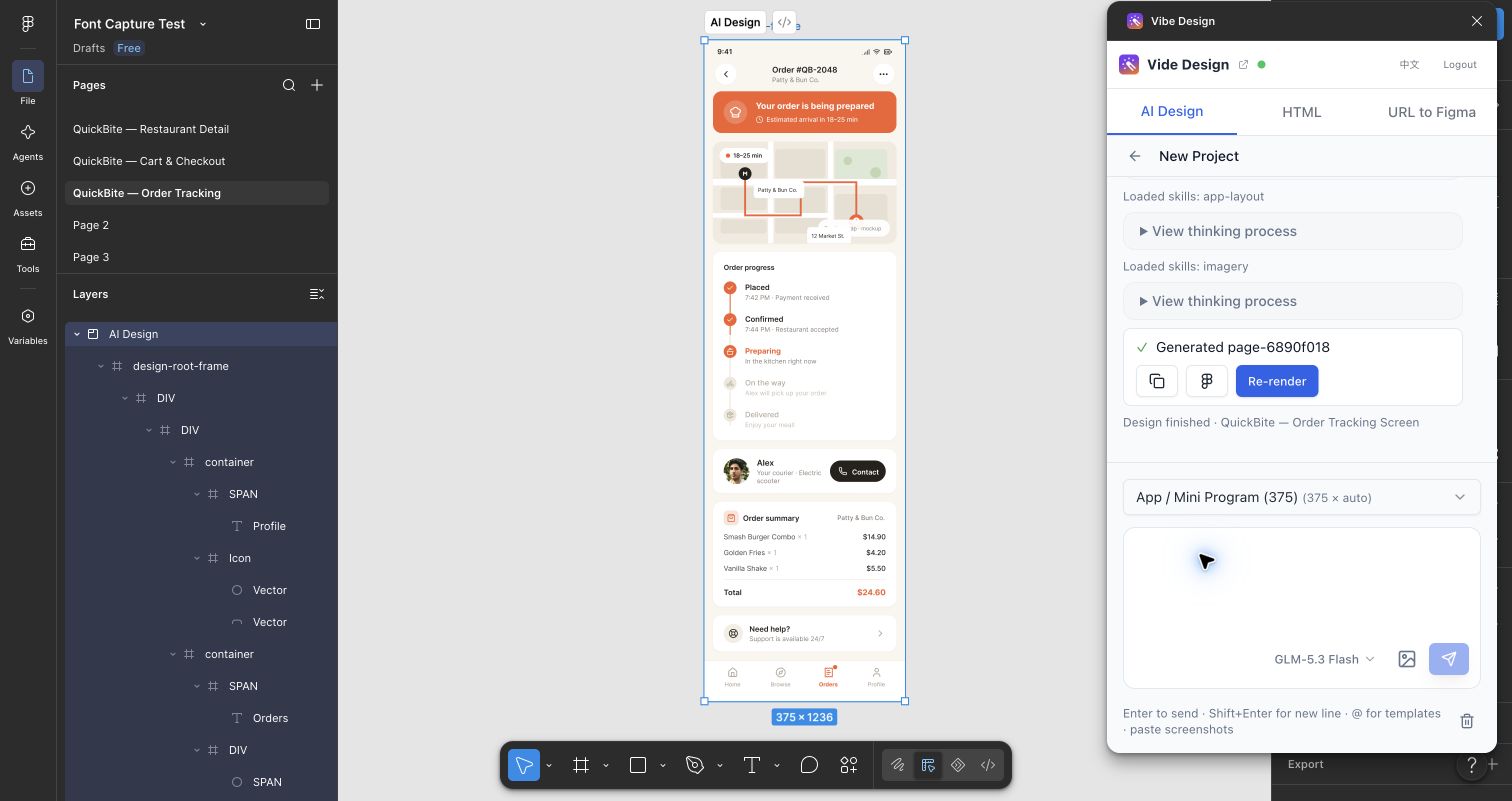
The Re-render control is available on a generated result in the plugin. Use it when the result is ready to be drawn again; there is no need to create a new project for every page.
5. Arrange and inspect the Figma output
Put the four screens next to one another in the order a customer would use them: Home → Restaurant → Checkout → Tracking. Zoom out to inspect the flow, then zoom back in to review each screen. The final overview at the top of this article shows all four on a single page.
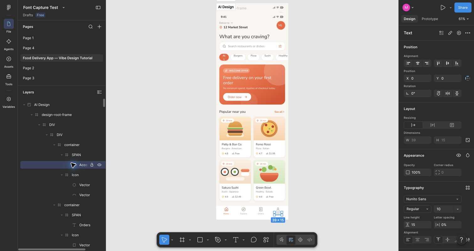
The imported design contains editable Figma layers. For example, selecting a bottom navigation label exposed its text and typography settings in Figma's right panel. You can adjust copy and layout directly after rendering.
Before sharing the design, check details that generation may miss:
- Content continuity. In this example, checkout and tracking both showed a $24.60 total, but the tracking screen listed different items and prices. Make the order summary match the cart.
- Small-screen text. The checkout promo button wrapped its “Apply” label awkwardly. Widen the control or shorten the label.
- Navigation labels. Some screens used different words for the same destination. Pick one set of labels and apply it throughout.
- Images and spacing. Confirm that every food image is visible and that cards, buttons, and safe areas still work at 375 px.
Vibe Design got the four-screen structure onto the canvas quickly. The best results came from giving each screen a clear brief, using another conversation for the next screen, using Re-render after revisions, and finishing with a careful pass through the editable Figma file.